BREWOLOGY
Art Direction: Paul Sheriff, Dermott MacCormack
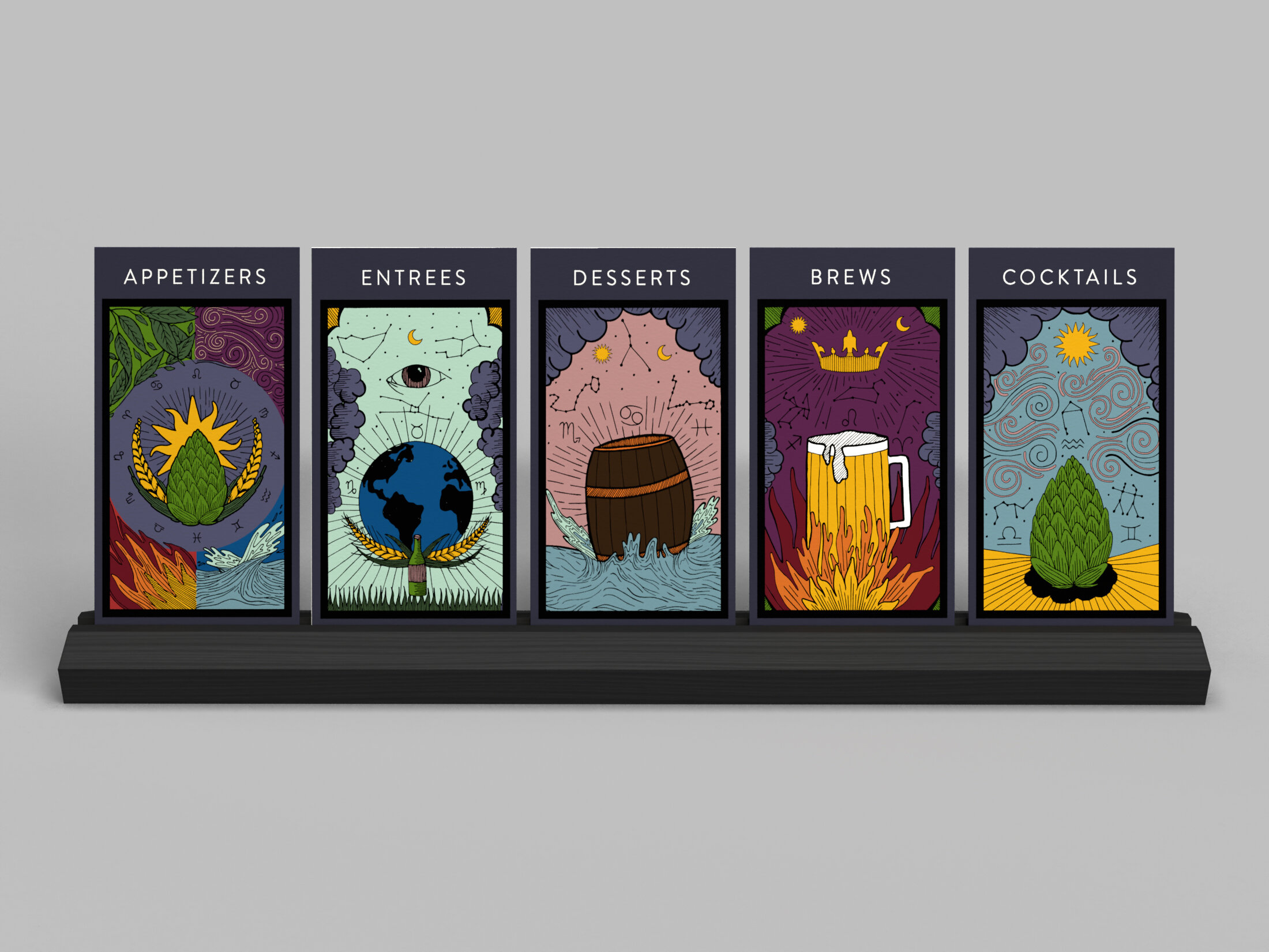
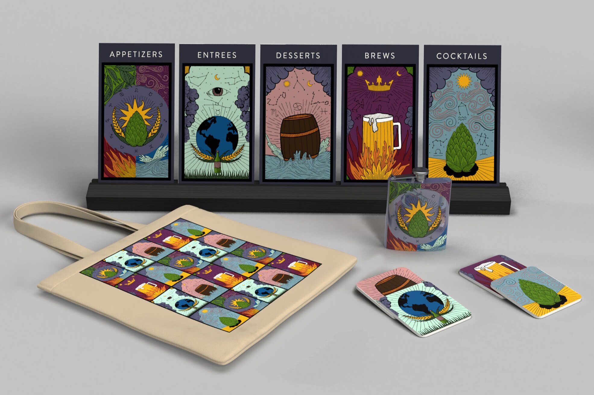
Brewology is an astrology themed Brewery with the goal to satisfy your sign. The menu features a unique list of appetizers, entrees, desserts, cocktails, and, of course, brews to appeal to your place in the zodiac world. Each menu includes one option crafted to your sign’s personality traits or interests. This was essential to include because people love personalization. We all want something crafted for us. With this aspect, Brewology doesn’t just appeal to beer lovers or astrology believers. It invites anyone looking for a unique and personalized experience.

Menu illustration sketches

PROCESS
The inspiration for this design came from old zodiac imagery, stained glass windows, and tarot cards. I first became inspired by old black and white astrology drawings for the fine line work they embodied. I wanted to take that black line quality and bring it to life with color. I referenced stained glass from churches for color inspiration. These windows use a variety of vibrant colors outlined in black. The illustration, style, and menu layout was inspired by tarot cards. They are well known for being illustrative as well encasing what each card is with type. Incorporating his inspiration and astrology further, I used the elements, water, fire, earth, and air for four of the illustrations including their affiliated zodiac signs in each.
The logo was created using the key points of Brewology’s identity, beer and astrology. I wanted to incorporate the 12 signs in the logo to allow for quintessence and identification. To do this, I added the sun so the signs could converge around it. The next challenge was adding the beer aspect in a way that would compliment astrology. After exploring different approaches, the hops and wheat became the symbol for brews. For the typography, I chose Garamond Tall Light as the typeface for Brewology to contrast the illustration style and push the astrology and tarot inspiration. I also used Proxima Nova Light to more so compliment the illustration style while also embellishing the serif font used above it.
Logo Draft 1
Logo Draft 2
Logo Draft 3


